Steven Seybold Portfolio Site
Welcome to Infected Media, the portfolio site of Steven Seybold, Art Director and Designer.
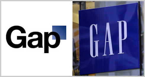
Everyone has an opinion on this one, it seems. While, at first, I hated the new look of the Gap logo, now I'm not so sure.
People hate change. I usually hate new logos when I am attached or accustomed to the old one. Most of the designers I know do as well well. Apple has shifted their logo and branding a few times and I've always been resistant. Over time, I get used to it and realize that a logo does not define a brand. It is always much more than that. With that in mind, I like that the Gap was trying to do something different and try and redefine itself. What I don't like at all is that they went back on their decision so quickly and let "the community" define who they are. Lame.
I really feel bad for the agency that was responsible for the rebranding as well. Man, they must feel awful right now. In any case, I'm sure they still got paid a ton.


All rights reserved.